
The Pack Is The Promise
What ten pieces say about what it means to be a Brodie Athlete™.

SEASONS
NEWSROOM
COMPANY
SEASONS
Spring ’26
Summer ’26
Fall ’25
Winter ’26


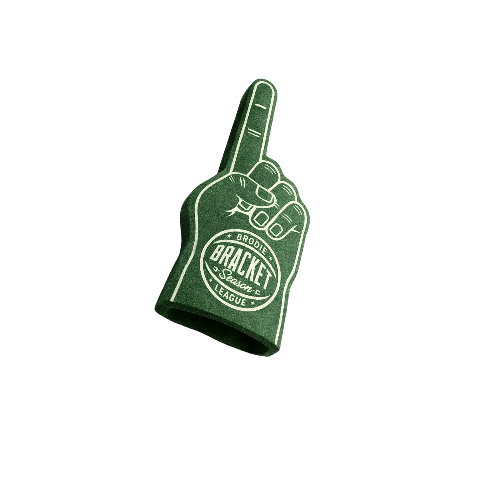
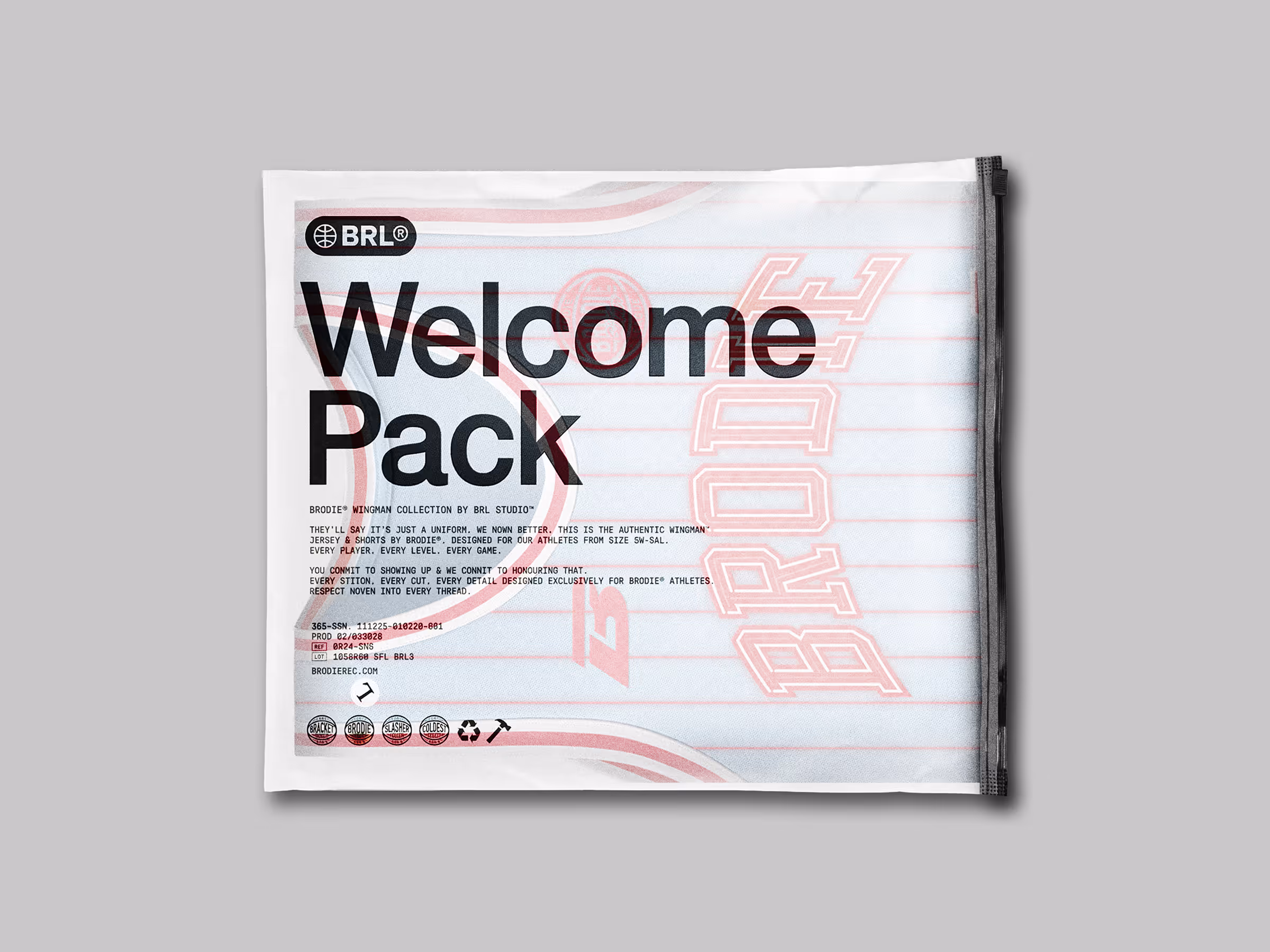
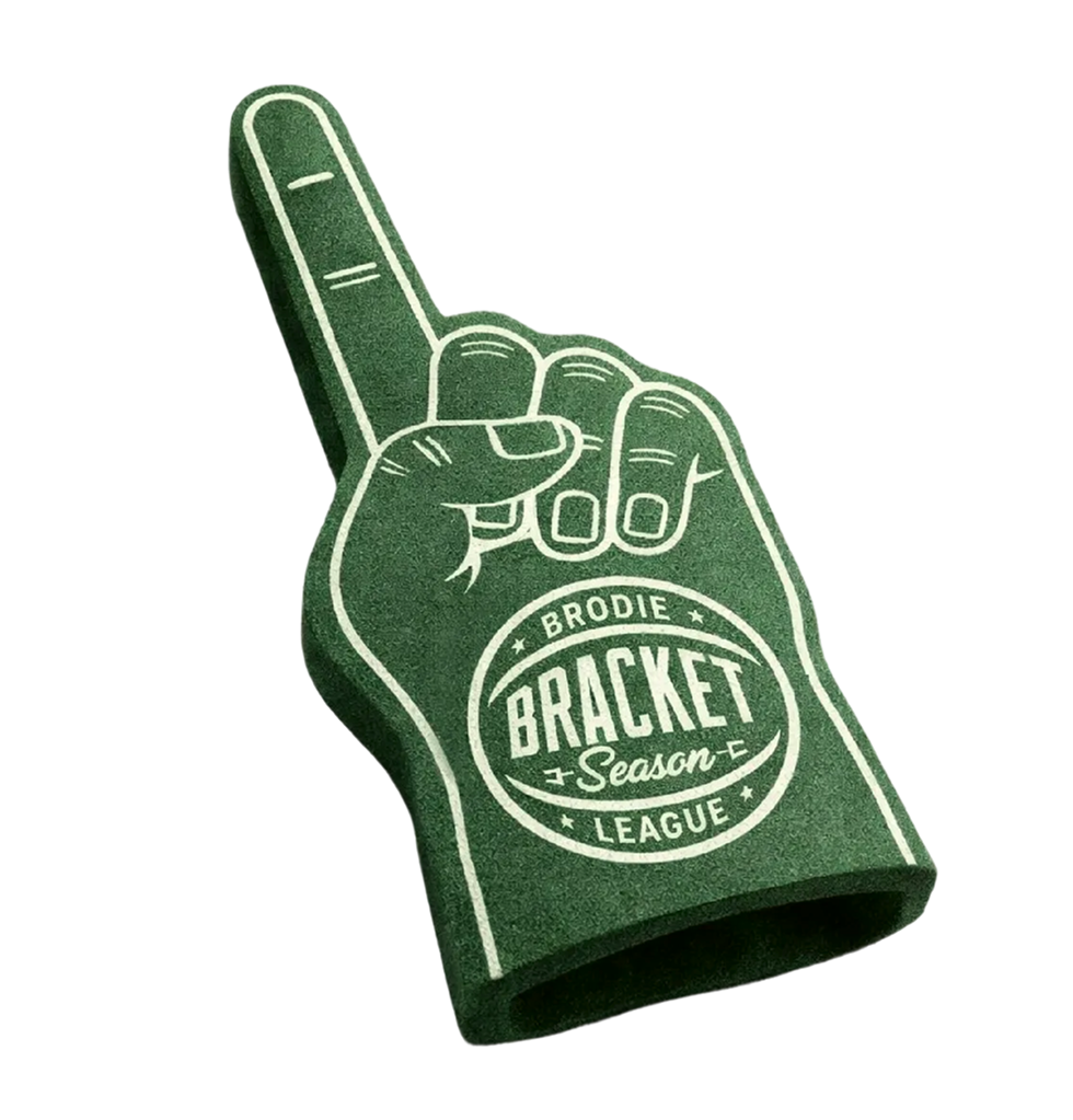
Welcome to Bracket Season
The road starts here. From the classroom to the championship. We pulled from collegiate canon and varsity dreams—the design language of March Madness when every possession becomes legacy and every game feels like history.
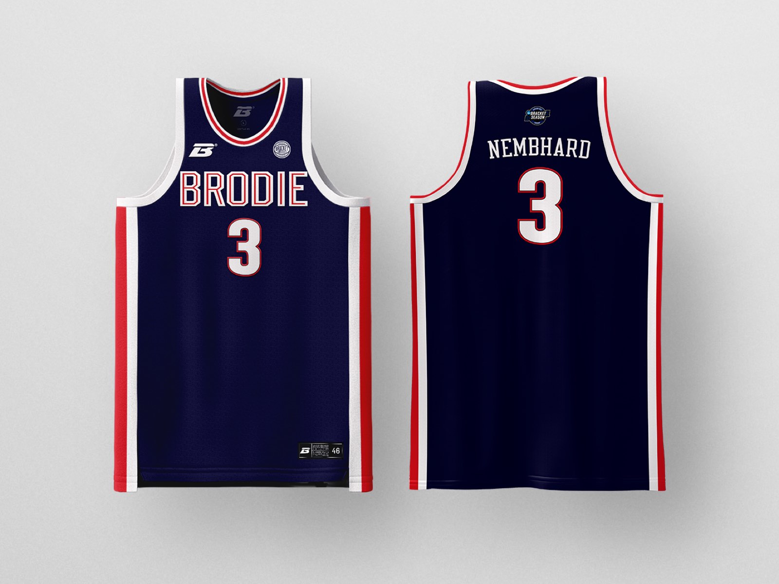
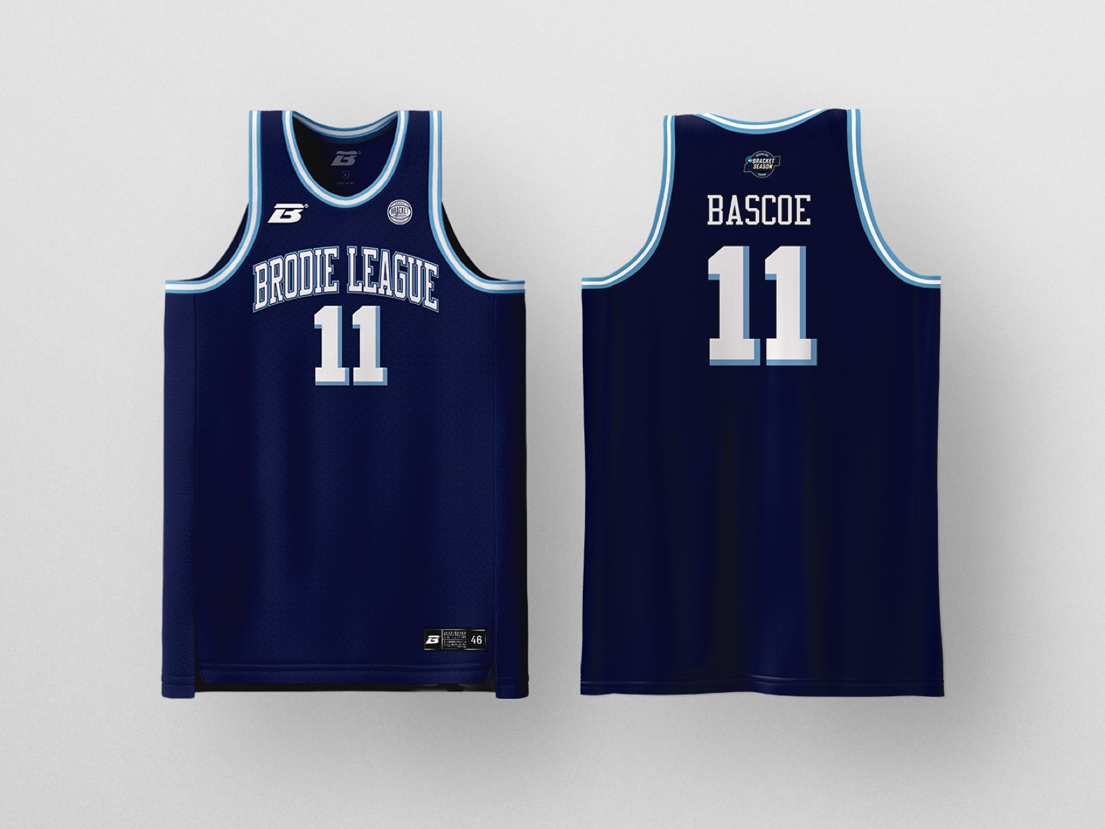
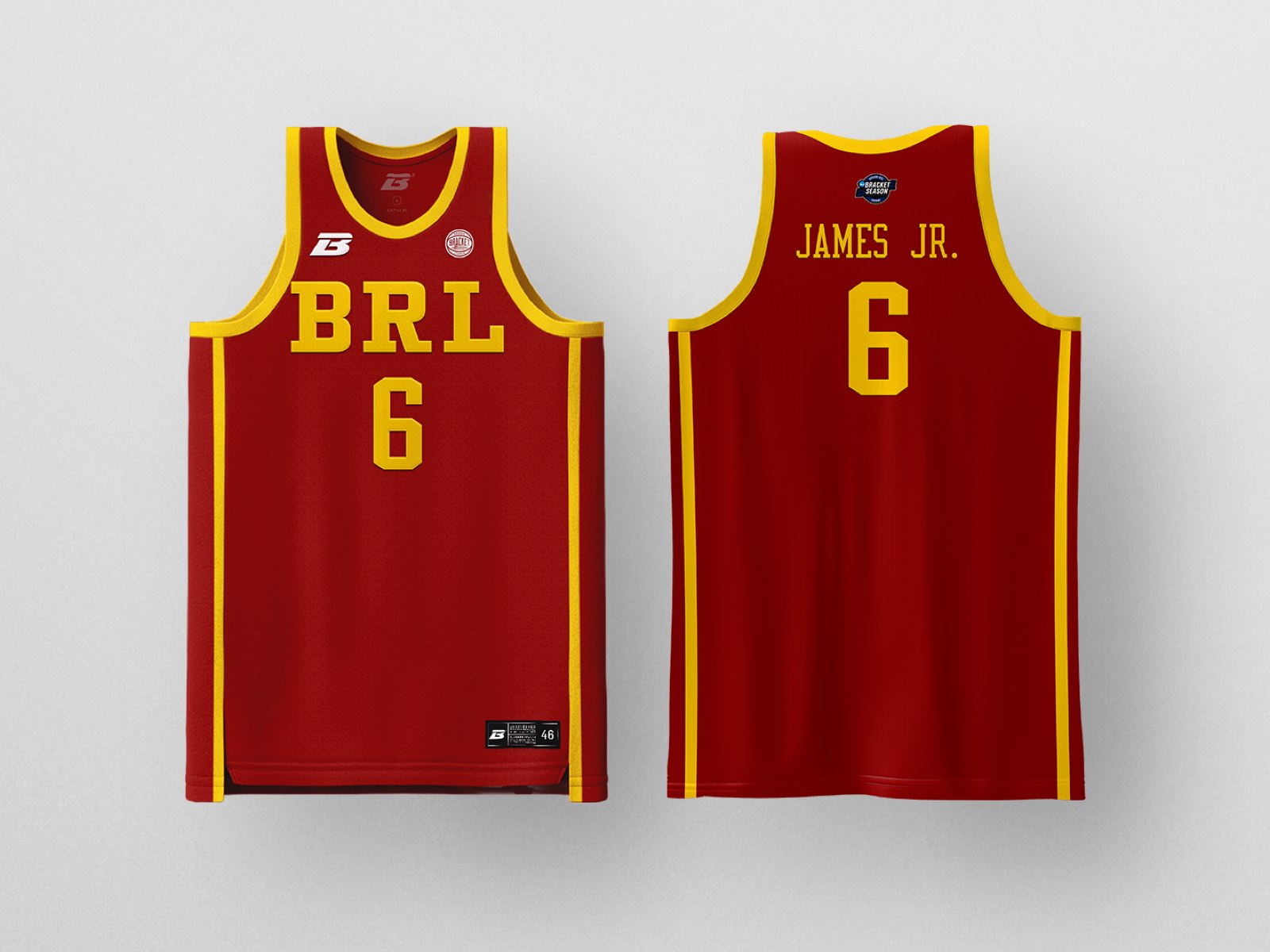
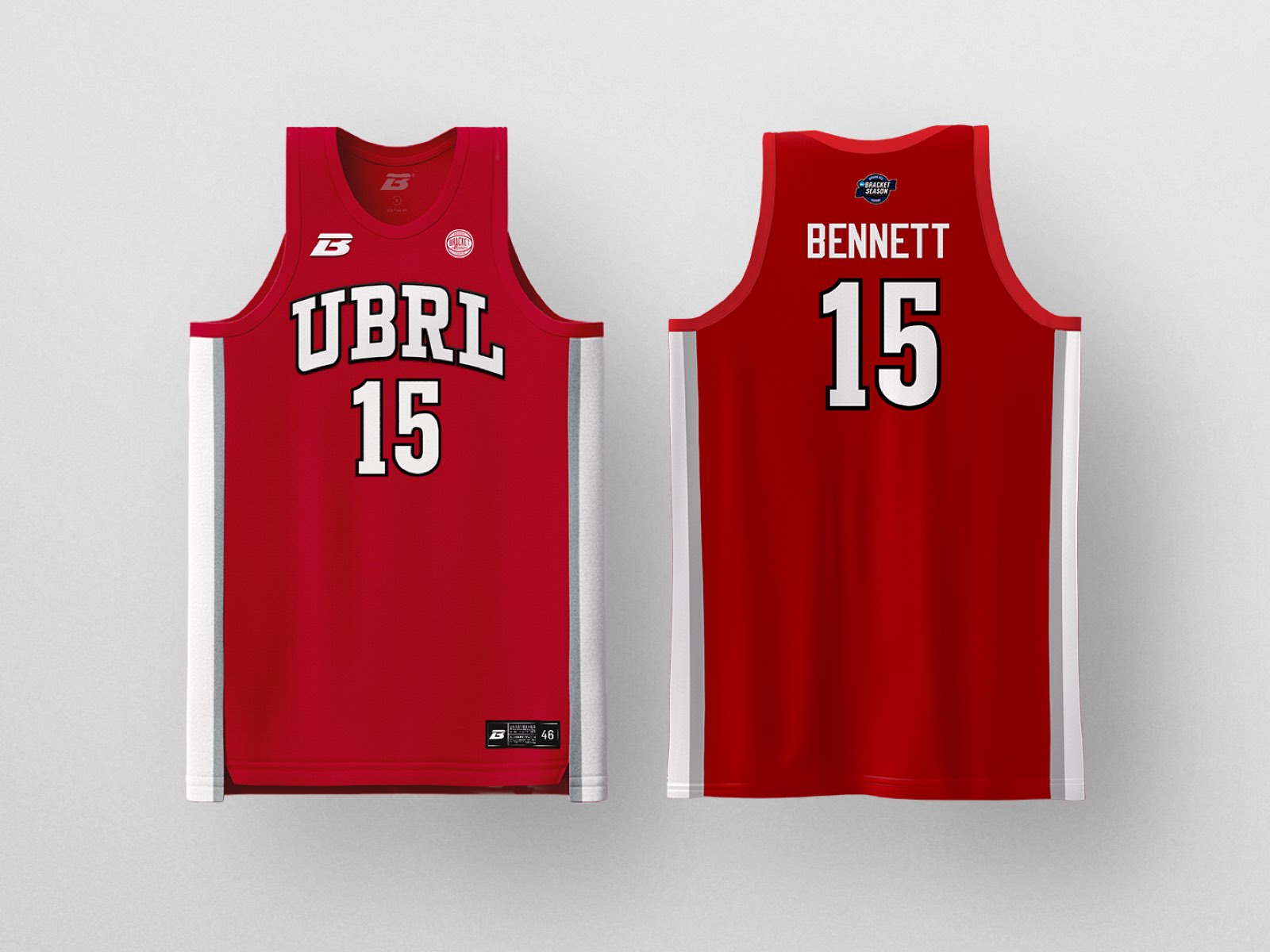
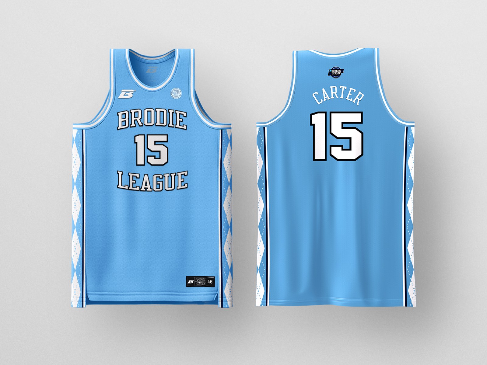
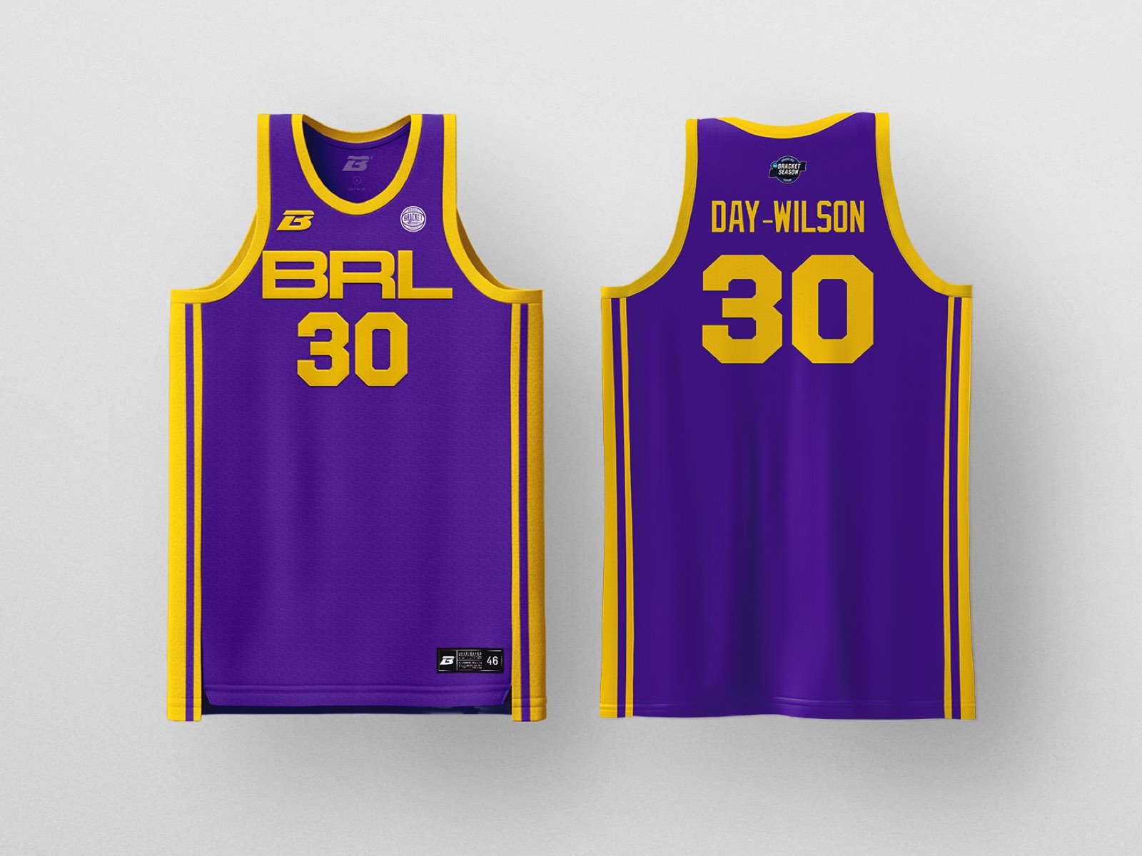
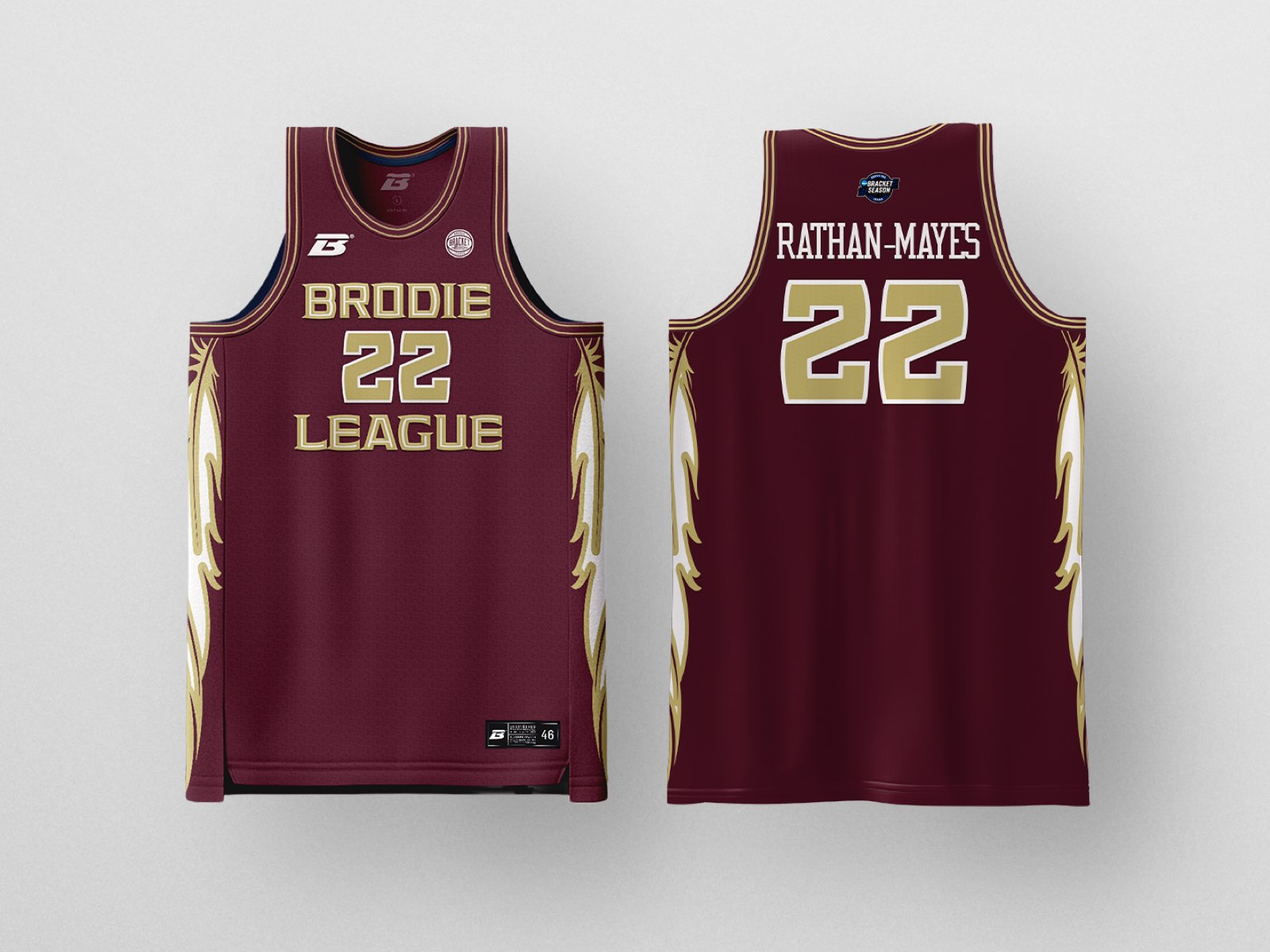
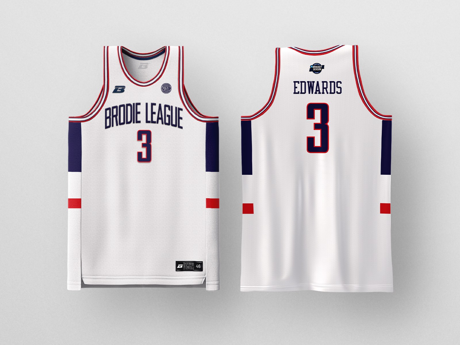
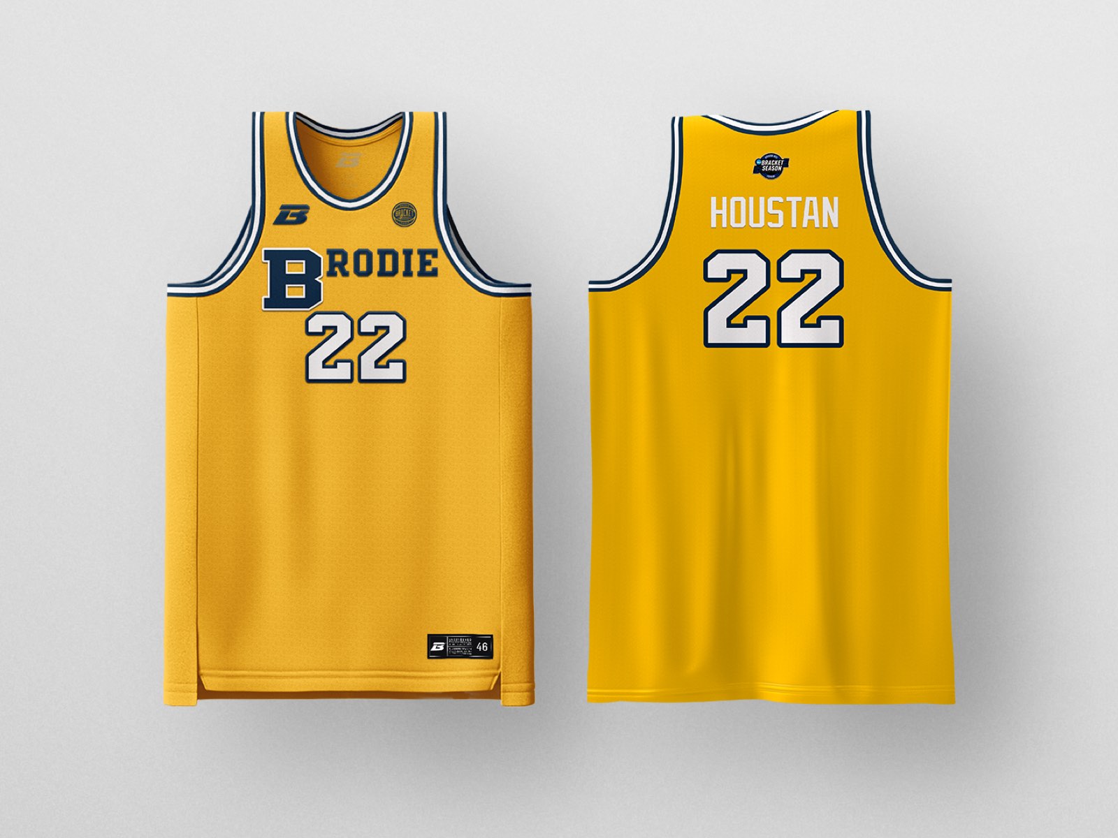
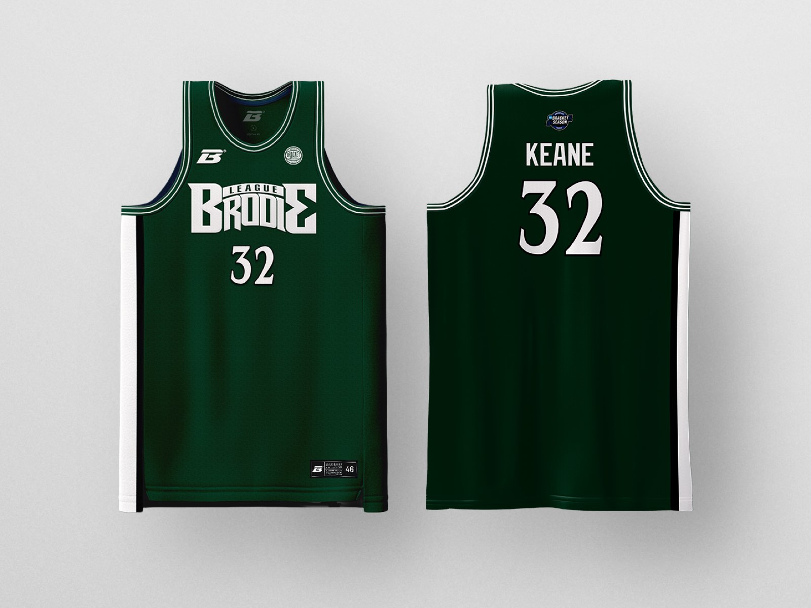
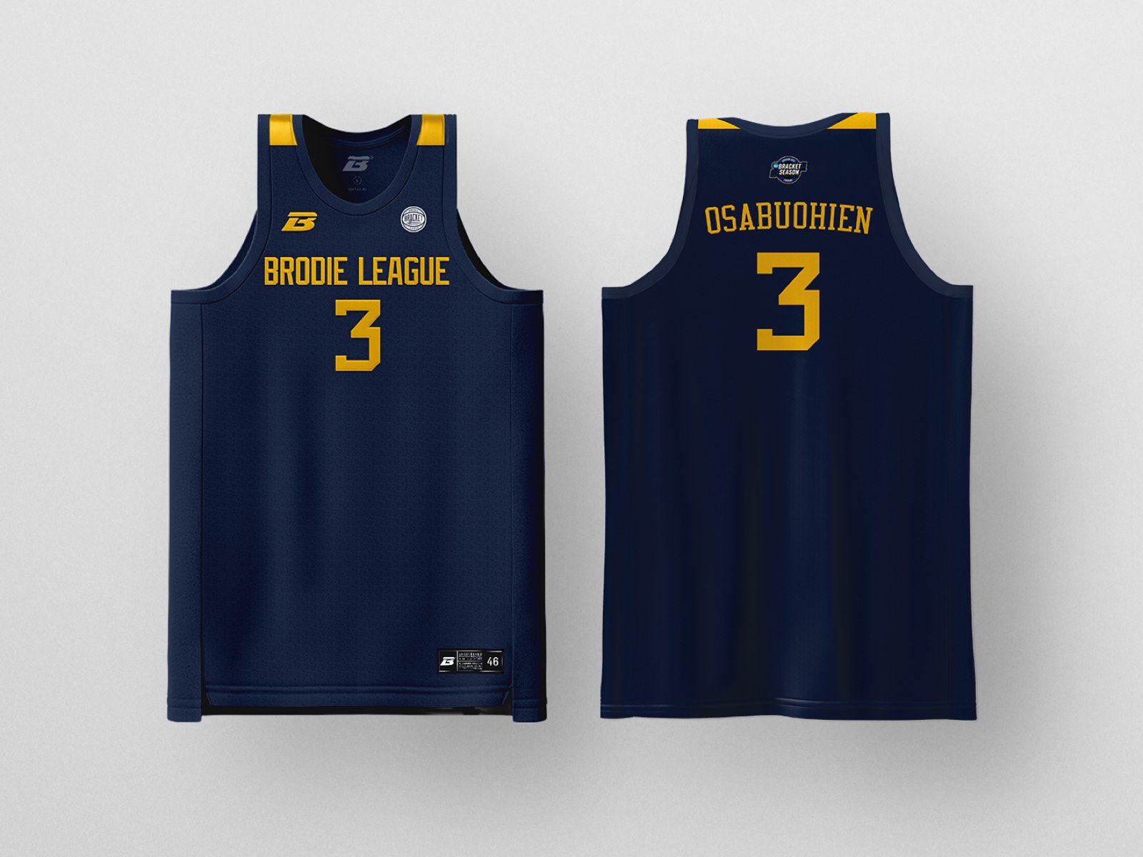
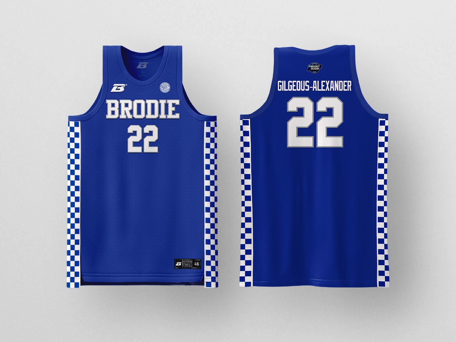
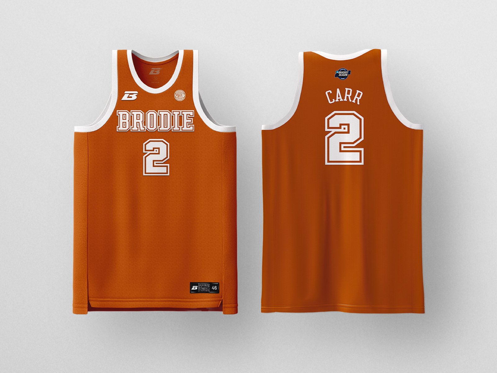
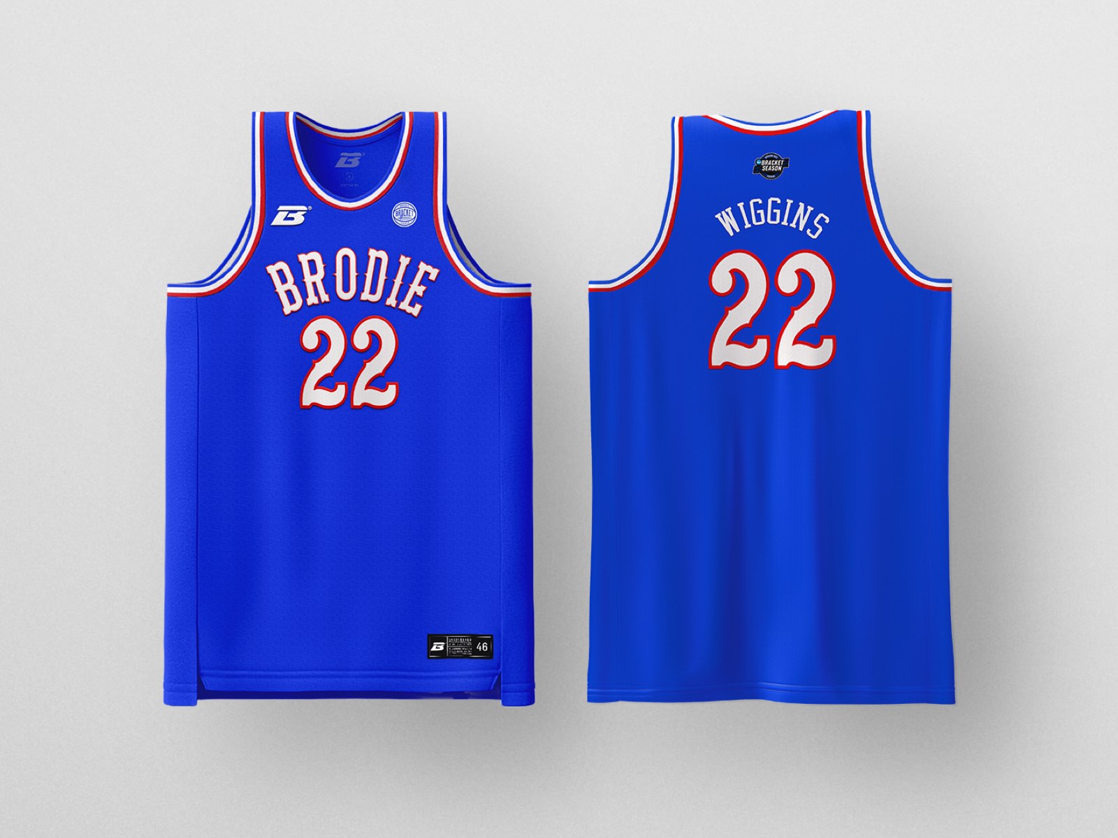
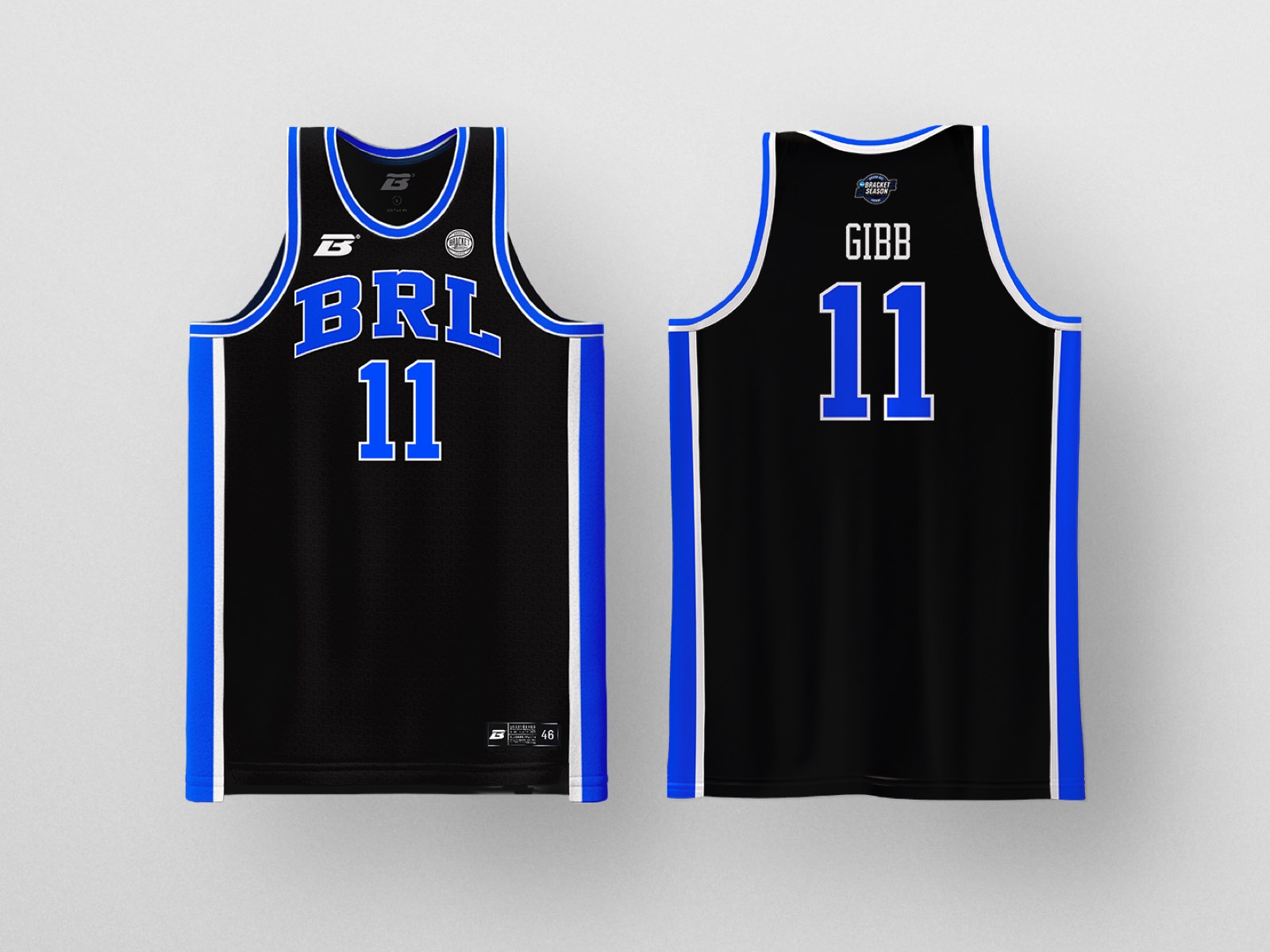
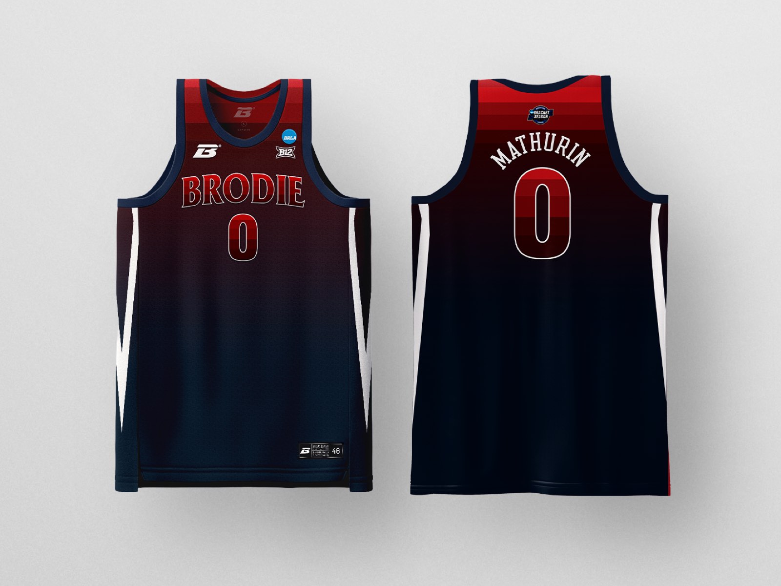
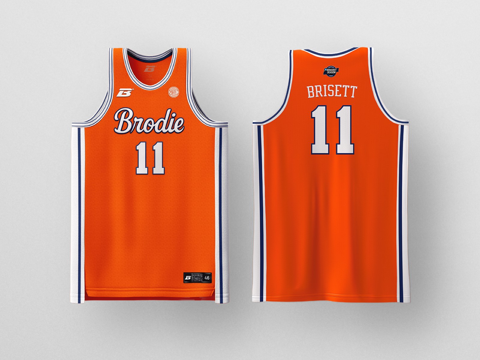
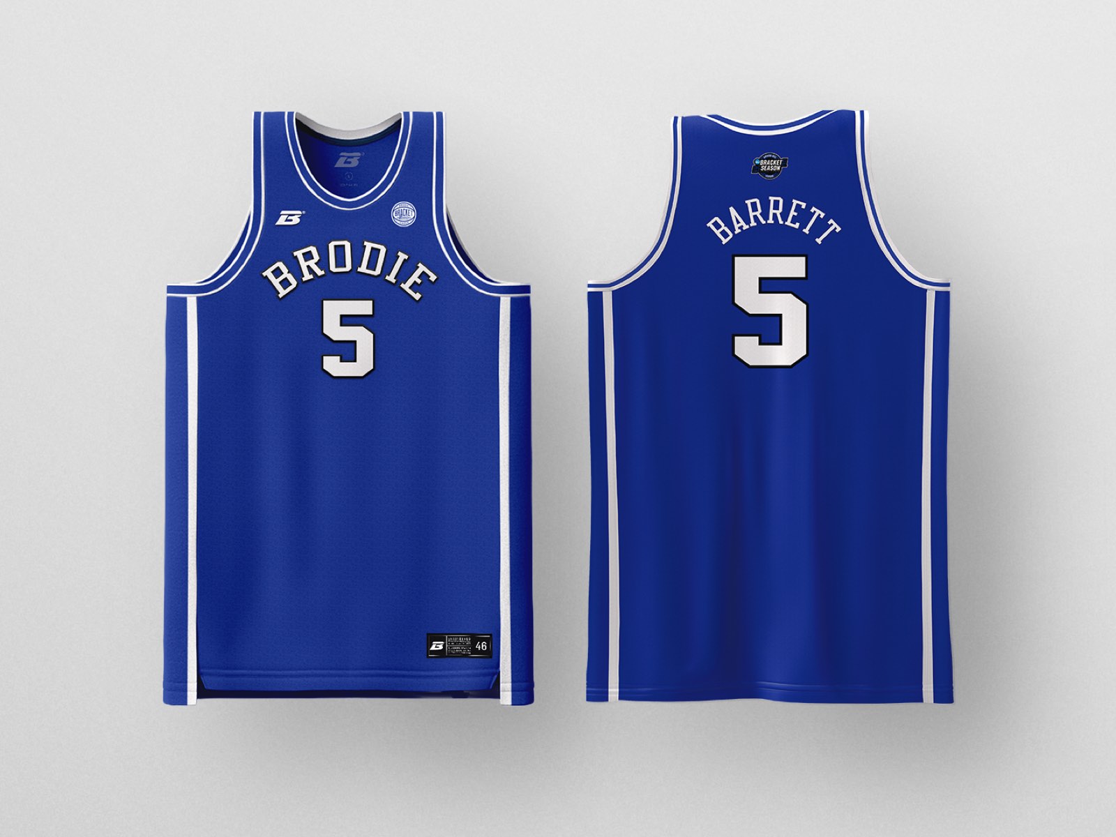
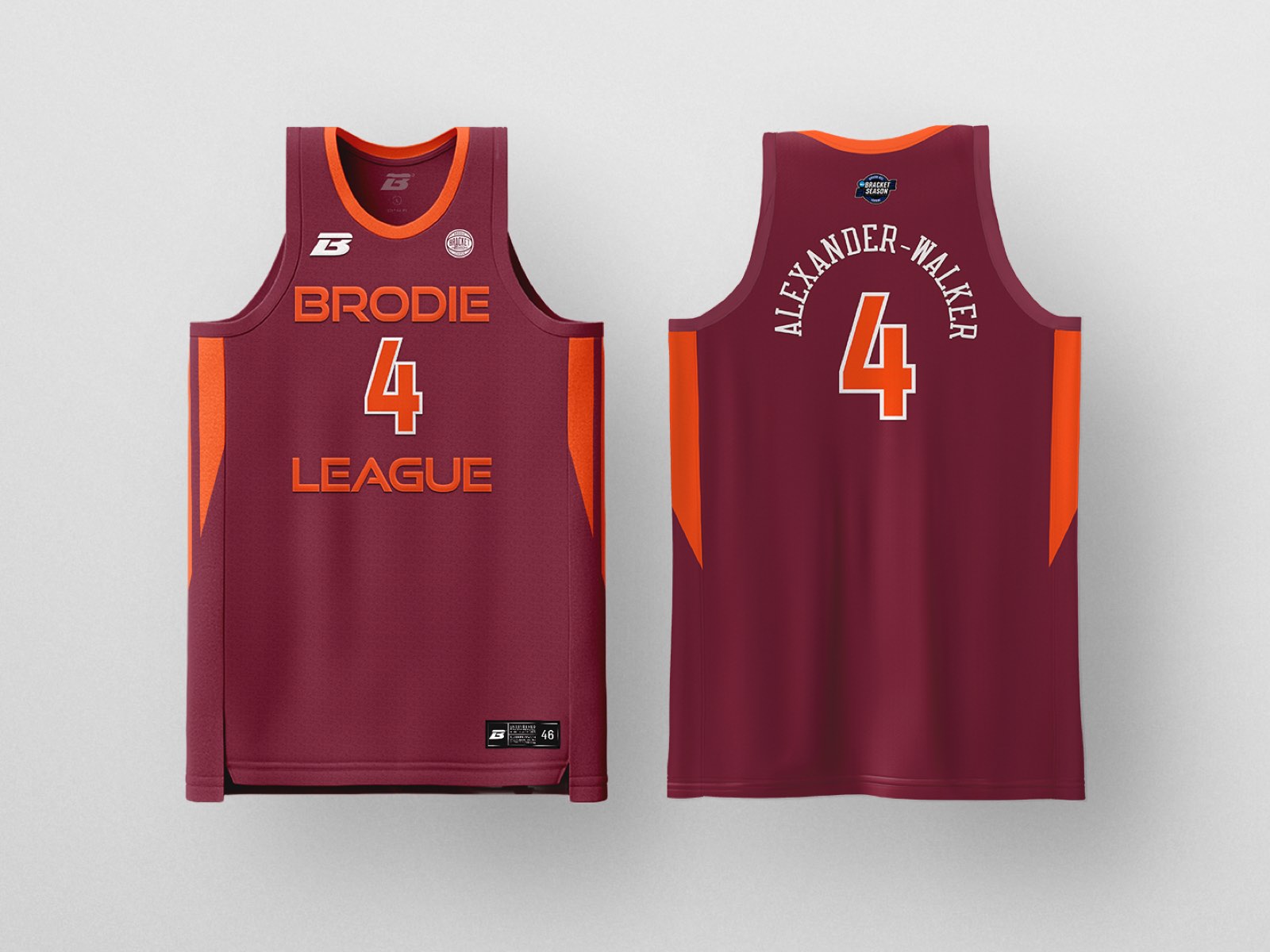
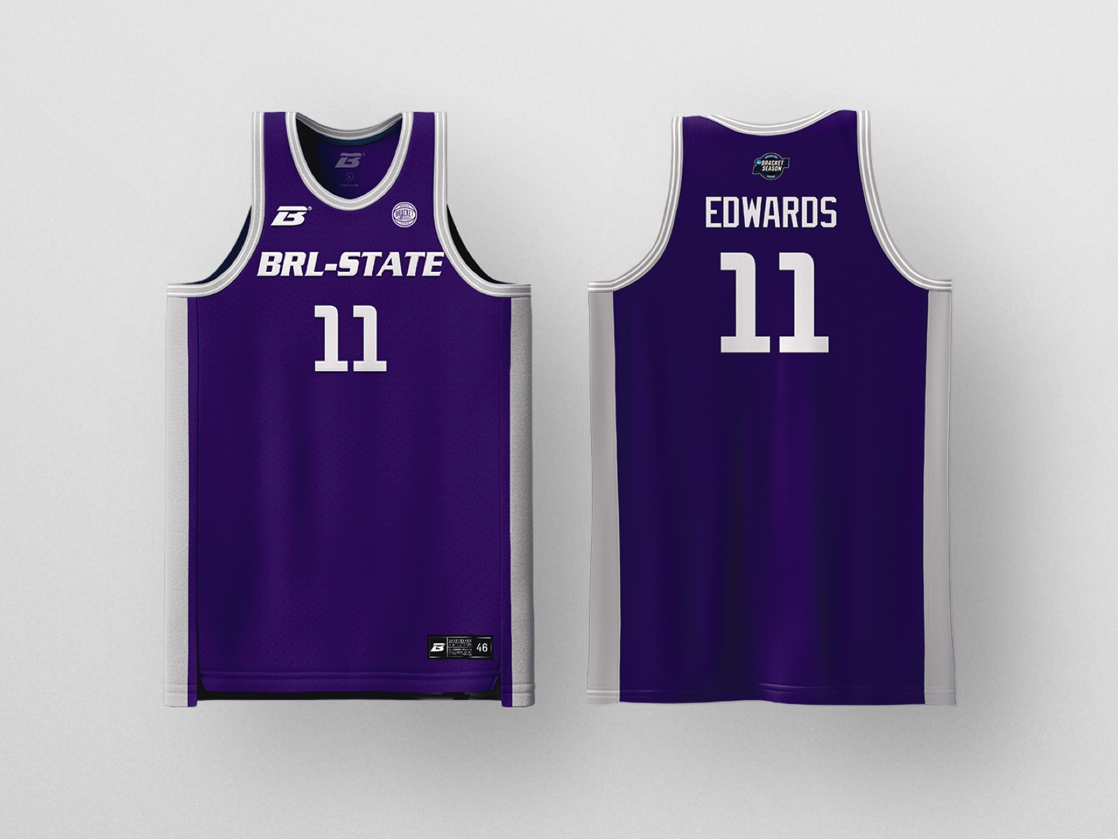


Varsity typography, letterman aesthetics, banner traditions—these design elements say: what you're doing matters enough to document, celebrate, and remember.
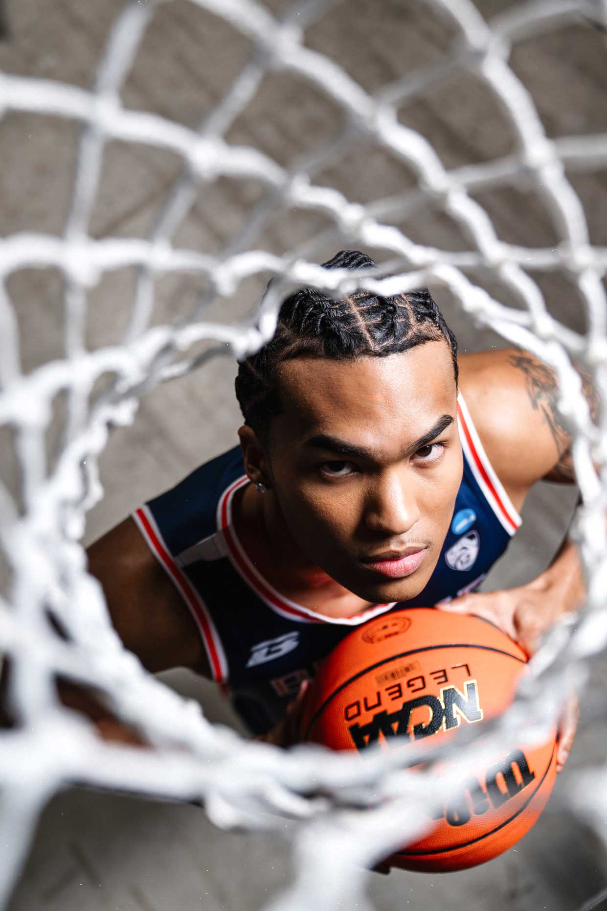
Our crest is the recognition that you're competing in a structure that honours achievement, celebrates progression, and builds toward a championship that actually means something. The bracket shows you the road: where you've been, where you're going, what stands between you and history.

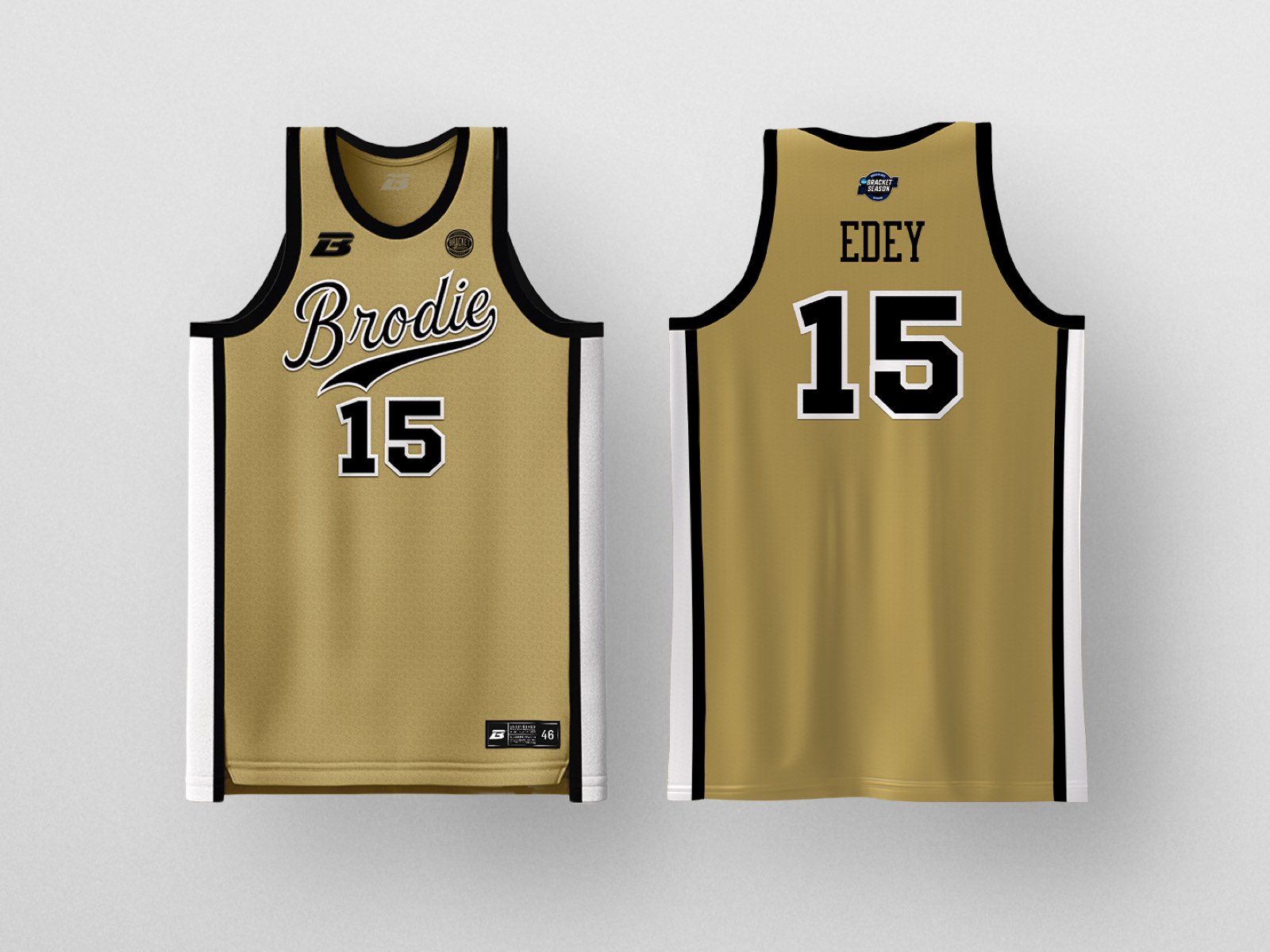
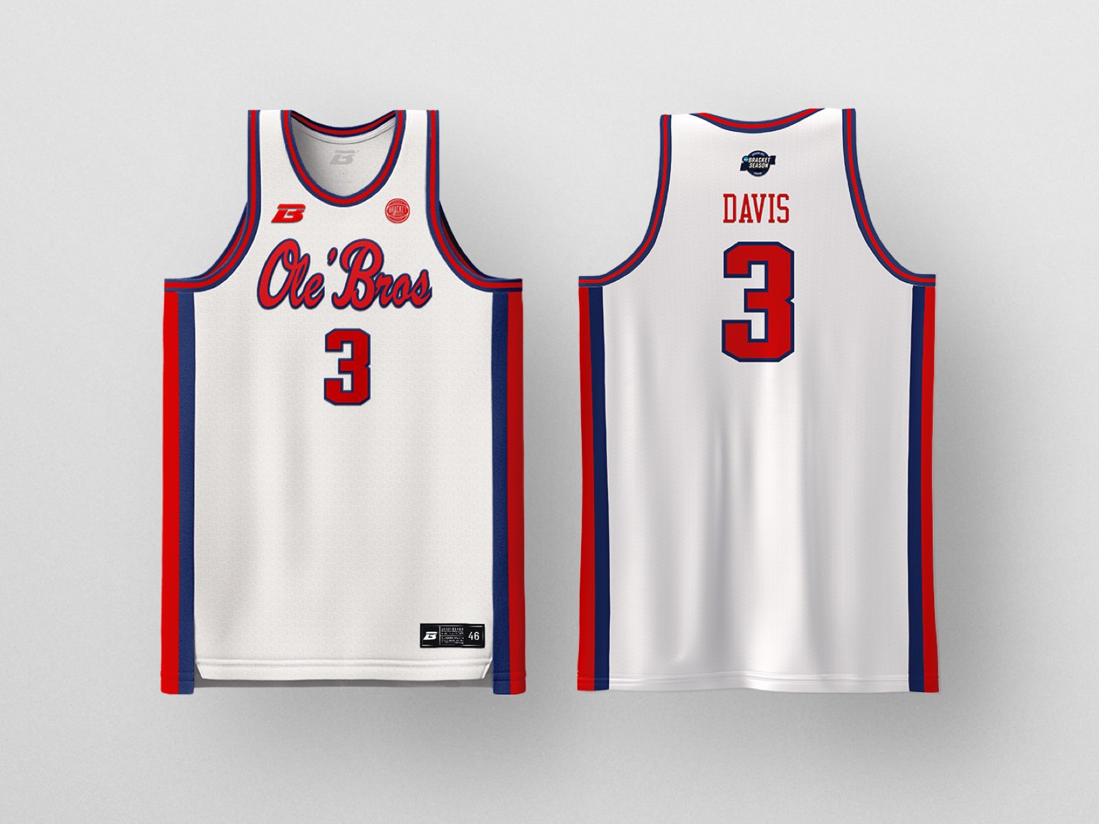
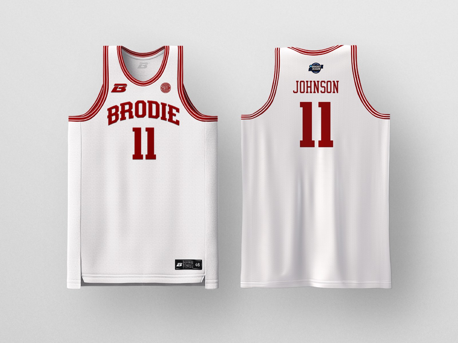
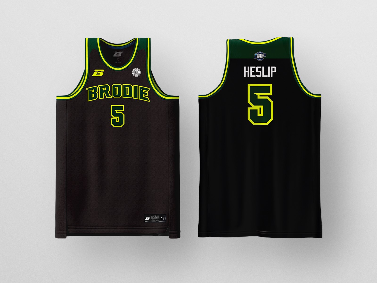
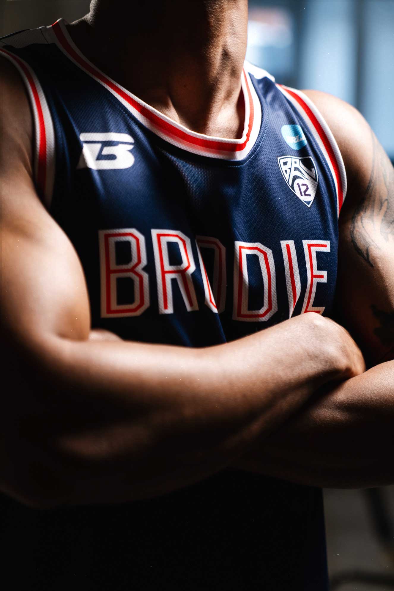
Block letters became the dominant collegiate style because they were functional (legible at distance), democratic (every letter got equal visual weight), and timeless (no trendy serifs or decorative flourishes to date the design). When you see block letters, you think: varsity, team, institution, legacy.
Varsity Typography emerged in the late 1800s when American universities began fielding athletic teams. The letterforms were bold, blocky, geometric—designed to be readable on wool jerseys from gymnasium bleachers and to translate well when sewn as chenille patches on letterman jackets.
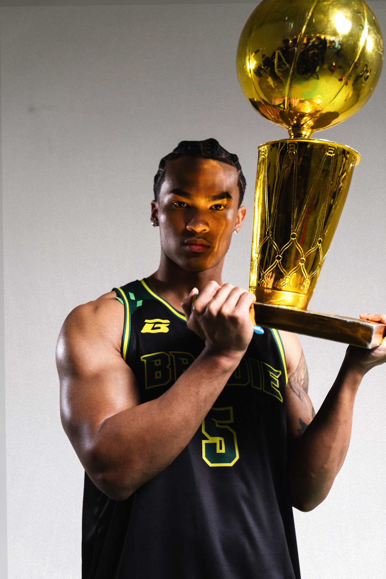
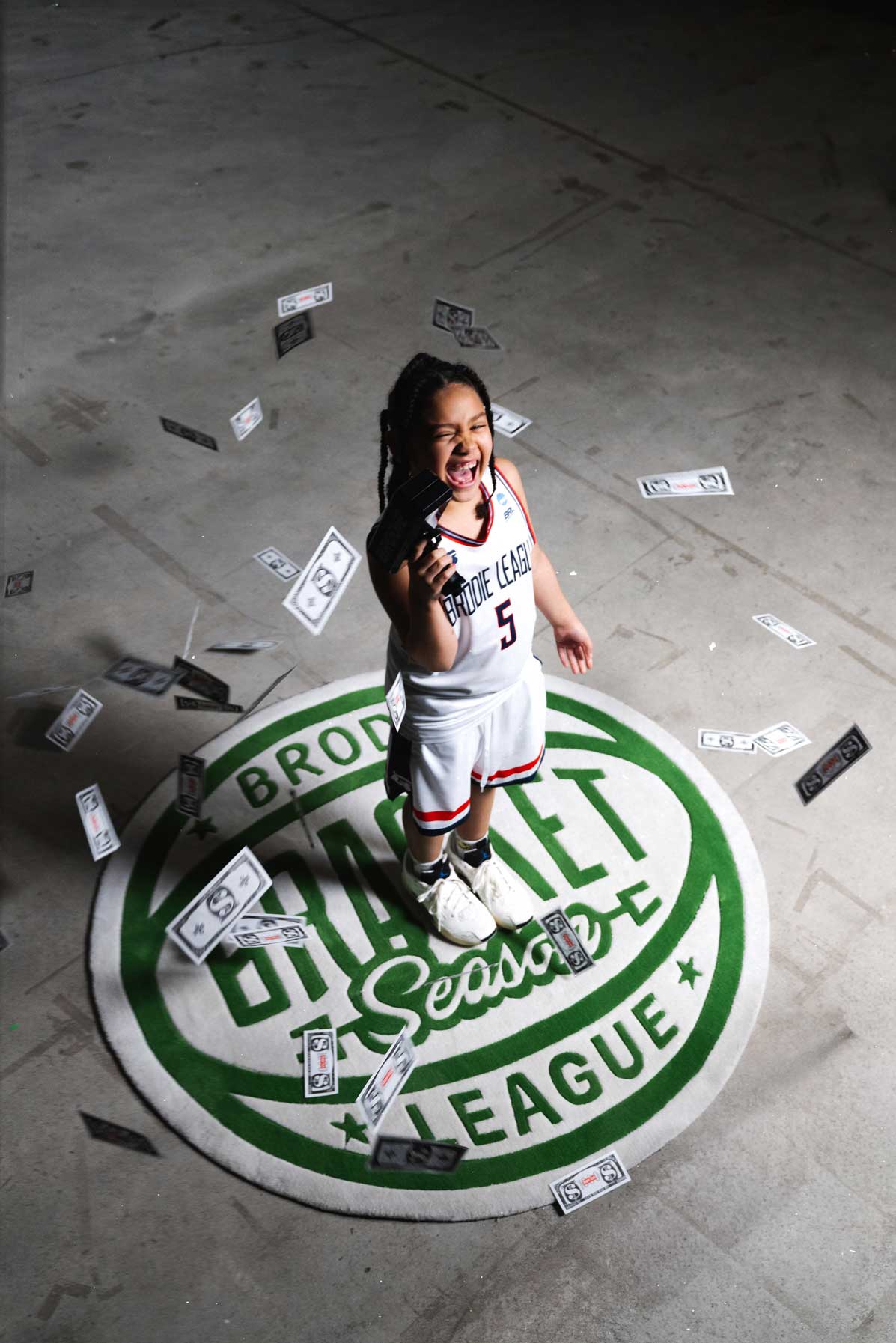
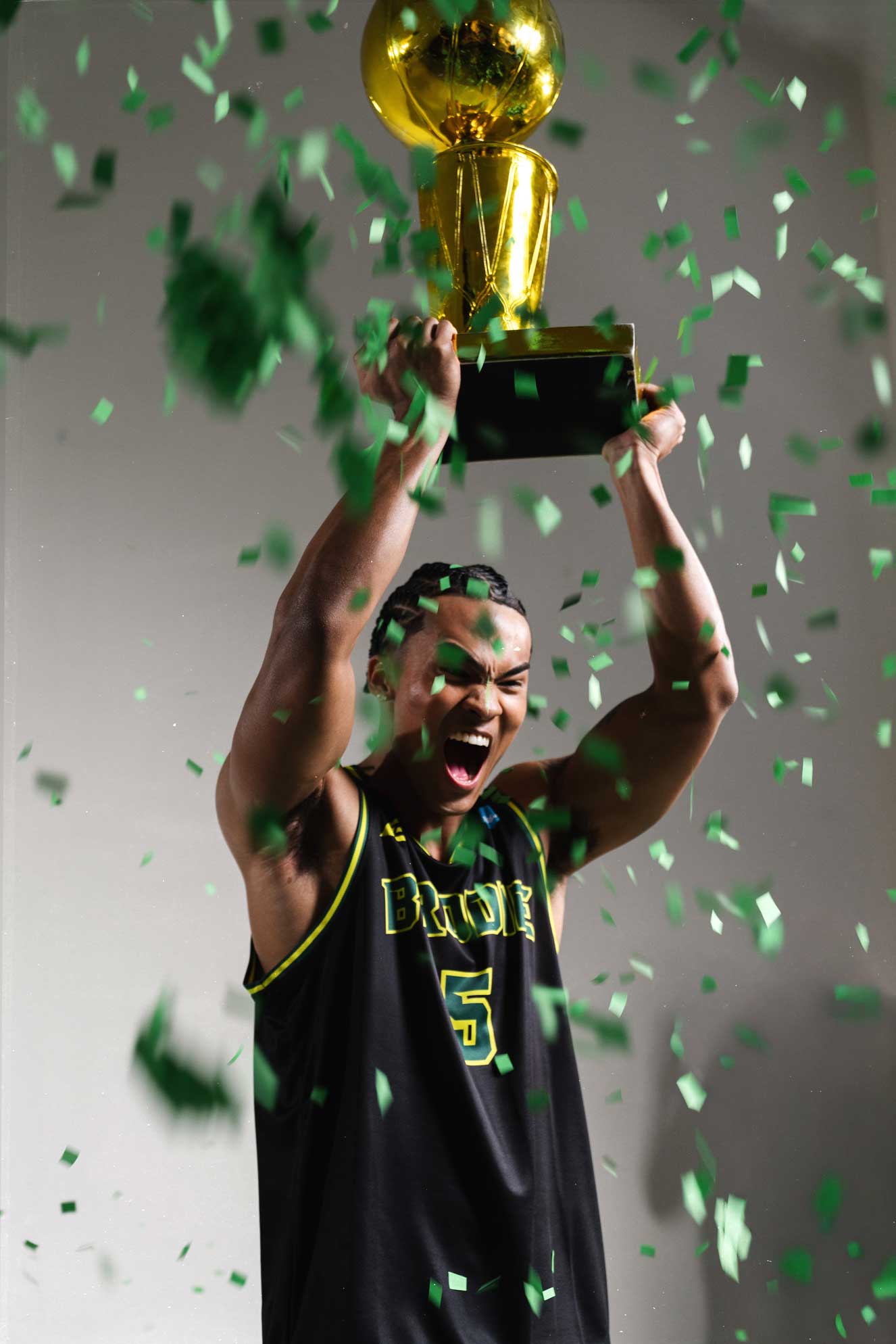
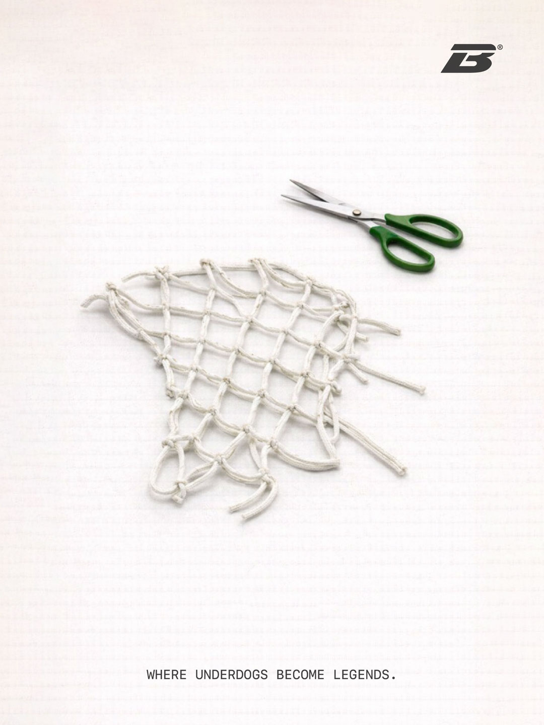
March Madness is equal parts institutionally serious and deliriously celebratory – fans storm courts, bands play fight songs, confetti canons fire. The championship trophy presentation happens on a ladder in the middle of a confetti storm. It's reverent and raucous at once.


The Road Starts Here


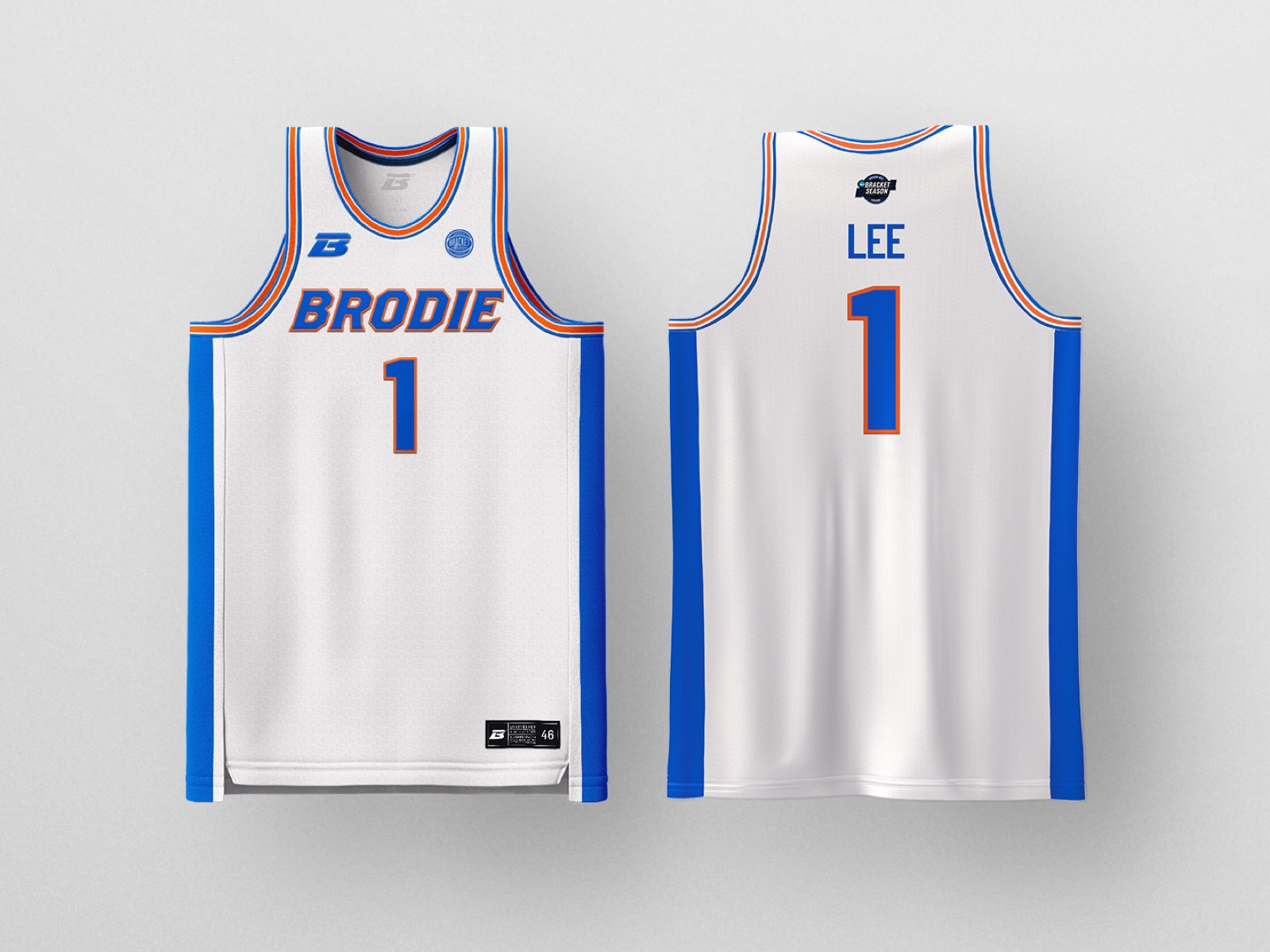
Designed for OUR athletes. From D5 → D1. Size SM → 5XL. Every Player. Every Level. Every Game.
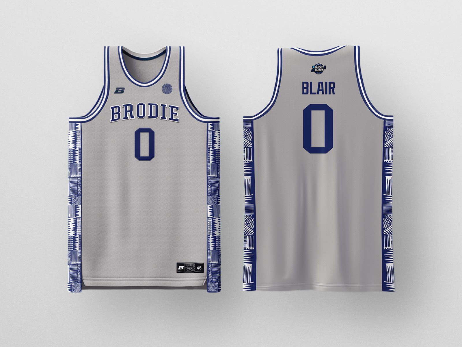
Designed for OUR athletes. From D5 → D1. Size SM → 5XL. Every Player. Every Level. Every Game.
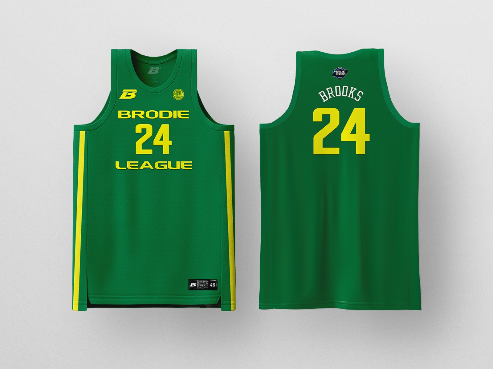
Designed for OUR athletes. From D5 → D1. Size SM → 5XL. Every Player. Every Level. Every Game.
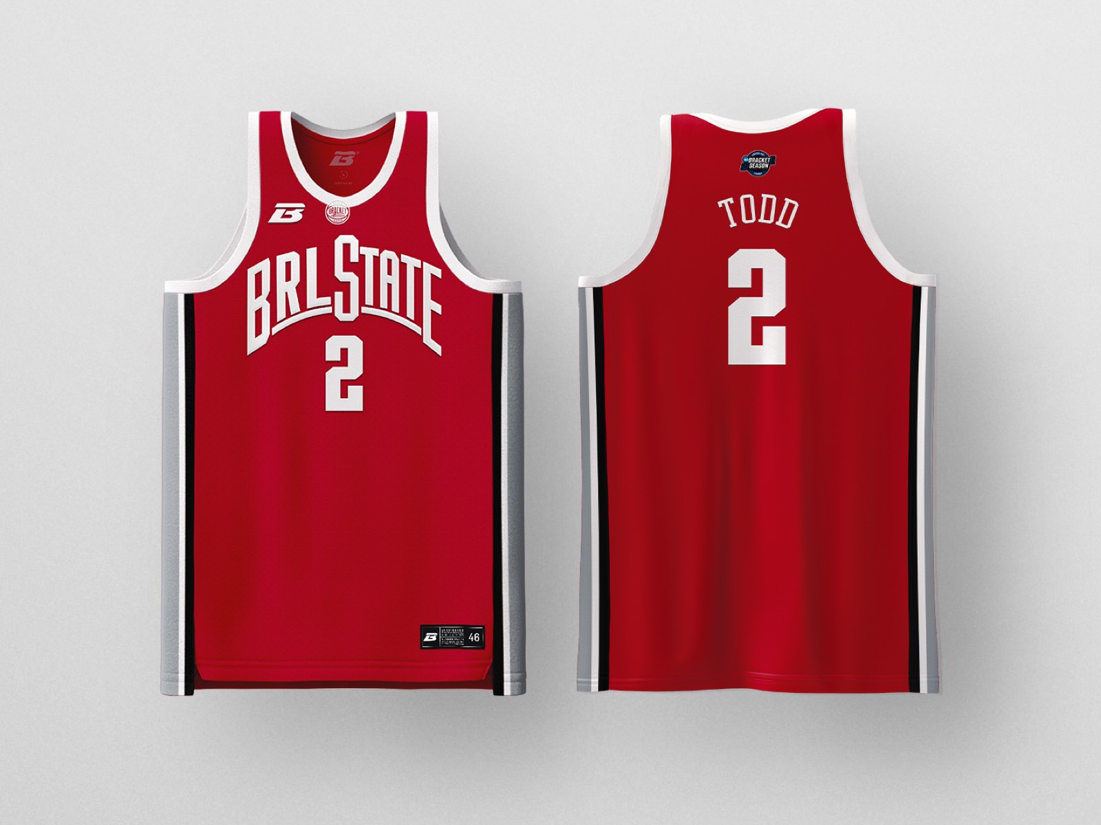
Designed for OUR athletes. From D5 → D1. Size SM → 5XL. Every Player. Every Level. Every Game.
Designed for OUR athletes. From D5 → D1. Size SM → 5XL. Every Player. Every Level. Every Game.
Designed for OUR athletes. From D5 → D1. Size SM → 5XL. Every Player. Every Level. Every Game.
Designed for OUR athletes. From D5 → D1. Size SM → 5XL. Every Player. Every Level. Every Game.
Designed for OUR athletes. From D5 → D1. Size SM → 5XL. Every Player. Every Level. Every Game.
Designed for OUR athletes. From D5 → D1. Size SM → 5XL. Every Player. Every Level. Every Game.
Designed for OUR athletes. From D5 → D1. Size SM → 5XL. Every Player. Every Level. Every Game.
Designed for OUR athletes. From D5 → D1. Size SM → 5XL. Every Player. Every Level. Every Game.
Designed for OUR athletes. From D5 → D1. Size SM → 5XL. Every Player. Every Level. Every Game.
Designed for OUR athletes. From D5 → D1. Size SM → 5XL. Every Player. Every Level. Every Game.
Designed for OUR athletes. From D5 → D1. Size SM → 5XL. Every Player. Every Level. Every Game.
Designed for OUR athletes. From D5 → D1. Size SM → 5XL. Every Player. Every Level. Every Game.
Designed for OUR athletes. From D5 → D1. Size SM → 5XL. Every Player. Every Level. Every Game.
Designed for OUR athletes. From D5 → D1. Size SM → 5XL. Every Player. Every Level. Every Game.
Designed for OUR athletes. From D5 → D1. Size SM → 5XL. Every Player. Every Level. Every Game.
Designed for OUR athletes. From D5 → D1. Size SM → 5XL. Every Player. Every Level. Every Game.
Designed for OUR athletes. From D5 → D1. Size SM → 5XL. Every Player. Every Level. Every Game.
Designed for OUR athletes. From D5 → D1. Size SM → 5XL. Every Player. Every Level. Every Game.
Designed for OUR athletes. From D5 → D1. Size SM → 5XL. Every Player. Every Level. Every Game.
Designed for OUR athletes. From D5 → D1. Size SM → 5XL. Every Player. Every Level. Every Game.
Designed for OUR athletes. From D5 → D1. Size SM → 5XL. Every Player. Every Level. Every Game.
Designed for OUR athletes. From D5 → D1. Size SM → 5XL. Every Player. Every Level. Every Game.
Designed for OUR athletes. From D5 → D1. Size SM → 5XL. Every Player. Every Level. Every Game.
Designed for OUR athletes. From D5 → D1. Size SM → 5XL. Every Player. Every Level. Every Game.
Designed for OUR athletes. From D5 → D1. Size SM → 5XL. Every Player. Every Level. Every Game.
Designed for OUR athletes. From D5 → D1. Size SM → 5XL. Every Player. Every Level. Every Game.
Designed for OUR athletes. From D5 → D1. Size SM → 5XL. Every Player. Every Level. Every Game.
Designed for OUR athletes. From D5 → D1. Size SM → 5XL. Every Player. Every Level. Every Game.
Designed for OUR athletes. From D5 → D1. Size SM → 5XL. Every Player. Every Level. Every Game.
Designed for OUR athletes. From D5 → D1. Size SM → 5XL. Every Player. Every Level. Every Game.
Designed for OUR athletes. From D5 → D1. Size SM → 5XL. Every Player. Every Level. Every Game.
Designed for OUR athletes. From D5 → D1. Size SM → 5XL. Every Player. Every Level. Every Game.